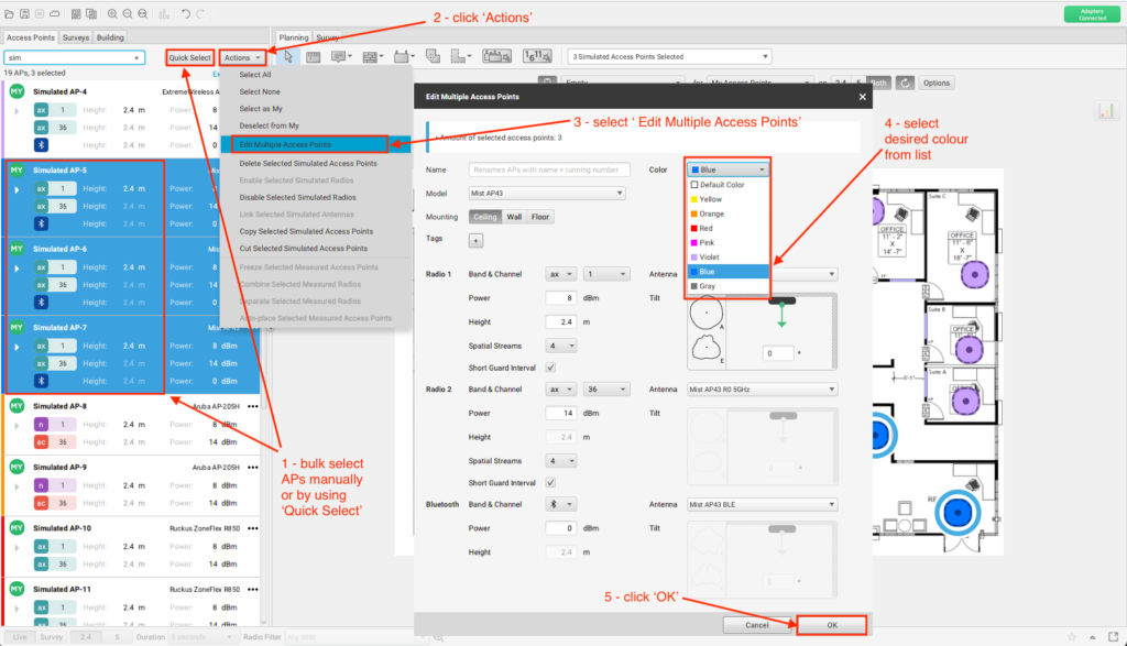
The ability to change the colour of AP icons was added in the release of Ekahau Pro version 10.3.1. This can be done by entering the AP edit menu and selecting the desired colour. APs can be modified one at a time or by bulk selection of APs. Bulk selection can easily be accomplished using the “Quick Select” feature to quickly select the group of APs that require the same configuration change, such as colour, height, Tx Power, antenna mode…

Default AP Colours
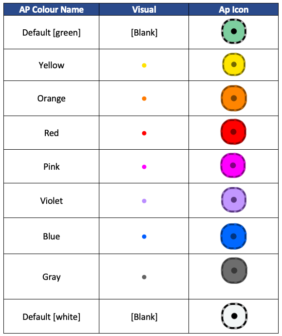
This leads us to the question: why you would want to change the colour of APs? First, let’s identify the default four colours, shown in the table below:

Why Colour APs?
What value is there to colouring APs? Well for starters, there are no rules for what colour you must assign to AP icons. As a result, you can choose different colours to represent anything relevant in your design that would be useful to highlight. Choosing different colours can facilitate communication to an audience leading to a reduction in errors or time that it takes to plan and execute a deployment. While certainly not an exhaustive list, here is a short example of differentiators you might want to consider when using custom AP colours:
- Internal vs. external antenna
- AP model
- Antenna connectors
- Enclosure type
- AP location (wall/ceiling/floor)
- Antenna model
- Antenna tilt
- Existing vs, new AP
- AP location (static/relocate)
- Power supply (PoE/battery/solar
- Bracket type (flush/recessed)
Available default colours to use with customization include:

To edit AP colours: Select either a single AP or a group of APs. Select an individual AP, then click on the ellipses (three dots):

For bulk editing, select a group of APs, then click Actions > Edit Multiple Access Points. From the ‘Color’ drop down in the ‘Edit Multiple Access Points’ window, choose the desired colour to assign to the selected APs.

Using Coloured APs in Custom Report Templates
The following examples show how you can gain even more value when using coloured APs by integrating with custom template reporting.
Tags with Coloured APs
The following data tag can be used to display AP colour and must be inside an AP loop:
<#${ap-color}#>

<#”loop-start” : {“type” : “floors”}#>
Floor name: <#${floor-name}#>
<#”loop-start” : {“type” : “aps”,
    “filter”: {
      “include”: {“name”: “Sim*”}
    }
}#>
AP Colour: <#${ap-color}#>
<#”loop-end” : {“type” : “aps”}#>
<#”loop-end” : {“type” : “floors”}#>
Output should look similar to this, with the blank entries showing the result from matching the default [green] AP colour:

Counting with Coloured APs
Counting may be useful for bill of material (BoM) or any other number of reasons to count the number of times a given colour of AP is used. For example, if blue represents an AP with an 4-element low-gain patch antenna and orange represents the same AP model but with a 4-element high-gain patch antenna, the count tag could be used to count the number of occurrences of each colour. Counting tags do not need to be inside a loop and can be run from the root level of the tag hierarchy.
Add the following code you the template:
Yellow: <#“count”: {
  “type”: “aps”,
    “filter”: {
      “include”: {
        “ap-color”: “yellow”
      }
    }
  }#>
Orange: <#“count”: {
  “type”: “aps”,
    “filter”: {
      “include”: {
        “ap-color”: “orange”
      }
    }
  }#>
Red: <#“count”: {
  “type”: “aps”,
    “filter”: {
      “include”: {
        “ap-color”: “red”
      }
    }
  }#>
Pink: <#“count”: {
  “type”: “aps”,
    “filter”: {
      “include”: {
        “ap-color”: “PINK”
      }
    }
  }#>
Violet: <#“count”: {
  “type”: “aps”,
    “filter”: {
      “include”: {
        “ap-color”: “VIOLET”
      }
    }
  }#>
Blue: <#“count”: {
  “type”: “aps”,
    “filter”: {
      “include”: {
        “ap-color”: “Blue”
      }
    }
  }#>
Gray: <#“count”: {
  “type”: “aps”,
    “filter”: {
      “include”: {
        “ap-color”: “Gray”
      }
    }
  }#>
Default: <#“count”: {
  “type”: “aps”,
    “filter”: {
      “include”: {
        “ap-color”: “default”
      }
    }
  }#>
Output should look similar to this:
Yellow: 1
Orange: 2
Red: 5
Pink: 1
Violet: 4
Blue: 3
Gray: 1
Default: 2
Alternatively, you can set this up in a table. Add the following code to the template.
Note: Font colours are used to highlight the colour in the table below. Additionally, the font/style defining character is the “<” (also known as the “Pac-man” character). Any displayed text will inherit the font settings of this single character. Additionally, colour labels can be written as all lower case, start with a capital letter, or all upper-case (as shown in the example below):
| AP Icon Colour | Occurrences |
|---|---|
| Default | <#“count”: { “type”: “aps”, “filter”: { “include”: { “ap-color”: “default” } } }#> |
| Yellow | <#“count”: { “type”: “aps”, “filter”: { “include”: { “ap-color”: “yellow” } } }#> |
| Orange | <#“count”: { “type”: “aps”, “filter”: { “include”: { “ap-color”: “orange” } } }#> |
| Red | <#“count”: { “type”: “aps”, “filter”: { “include”: { “ap-color”: “red” } } }#> |
| Pink | <#“count”: { “type”: “aps”, “filter”: { “include”: { “ap-color”: “PINK” } } }#> |
| Violet | <#“count”: { “type”: “aps”, “filter”: { “include”: { “ap-color”: “VIOLET” } } }#> |
| Blue | <#“count”: { “type”: “aps”, “filter”: { “include”: { “ap-color”: “Blue” } } }#> |
| Gray | <#“count”: { “type”: “aps”, “filter”: { “include”: { “ap-color”: “Gray” } } }#> |
Output should look similar to this:
| AP Icon Colour | Occurrences |
|---|---|
| Default | 2 |
| Yellow | 1 |
| Orange | 2 |
| Red | 5 |
| Pink | 1 |
| Violet | 4 |
| Blue | 3 |
| Gray | 1 |
Conditional Statements with Coloured APs
Add the following code you the template:
<#”loop-start” : {“type” : “aps”,
    “filter”: {
      “include”: {“name”: “Sim*” }
    }
}#>
<#{"if":{"count":{"filter":{"include":{"ap-color”:”yellow”}},"comparator":">","compare-to":"0","type":"aps"}}}#>
Yellow colour detected.
<#{“endif":{}}#>
<#{"if":{"count":{"filter":{"include":{"ap-color”:”orange”}},"comparator":">","compare-to":"0","type":"aps"}}}#>
Orange colour detected.
<#{“endif":{}}#>
<#{"if":{"count":{"filter":{"include":{"ap-color”:”red”}},"comparator":">","compare-to":"0","type":"aps"}}}#>
Red colour detected.
<#{“endif":{}}#>
<#{"if":{"count":{"filter":{"include":{"ap-color”:”pink”}},"comparator":">","compare-to":"0","type":"aps"}}}#>
Pink colour detected.
<#{“endif":{}}#>
<#{"if":{"count":{"filter":{"include":{"ap-color”:”violet”}},"comparator":">","compare-to":"0","type":"aps"}}}#>
Violet colour detected.
<#{“endif":{}}#>
<#{"if":{"count":{"filter":{"include":{"ap-color”:”blue”}},"comparator":">","compare-to":"0","type":"aps"}}}#>
Blue colour detected.
<#{“endif":{}}#>
<#{"if":{"count":{"filter":{"include":{"ap-color”:”gray”}},"comparator":">","compare-to":"0","type":"aps"}}}#>
Gray colour detected.
<#{“endif":{}}#>
<#{"if":{"count":{"filter":{"include":{"ap-color”:”default”}},"comparator":">","compare-to":"0","type":"aps"}}}#>
Default colour detected.
<#{“endif":{}}#>
<#”loop-end” : {“type” : “aps”}#>
Output should look similar to this:
Violet colour detected.
Red colour detected.
Red colour detected.
Red colour detected.
Red colour detected.
Red colour detected.
Pink colour detected.
Gray colour detected.
Default colour detected.
Default colour detected.
Violet colour detected.
Yellow colour detected.
Violet colour detected.
Violet colour detected.
Blue colour detected.
Blue colour detected.
Blue colour detected.
Orange colour detected.
Orange colour detected.
Disable Colour APs in Visualization
While you may want to use colouring to identify APs internally during the design exercise, you may not want to display all of those colours in the generated report to share with the client/stakeholder. The ‘show-custom-colors’ data tag can be used to make this change. When true: APs use all custom & default colours. When false: APs are displayed only with default colours. The following visualization tag can be added to enable/disable non-default colours in the visualization:
show-custom-colors (true/false default: true)As ‘show-custom-colors’ is true by default, running the following template code will generate the visualization colourized APs:
<#”loop-start” : {“type” : “floors”}#>
<#${floor-name}#>

<#"visualization":{
  "aps": {}
}#>

}#>
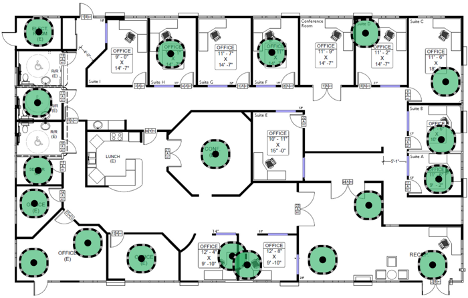
Output should look similar to this:

In order to remove non-default colours from visualizations when the report is generated, add the following code you the template:
<#"visualization":{
  "aps": {
    “show-custom-colors”: “false”
  }
}#>


<#”loop-end” : {“type” : “floors”}#>
Output should look similar to this:

Slàinte!
References
Ekahau custom report documentation
https://support.ekahau.com/hc/en-us/sections/115001529668
Data Tag
https://support.ekahau.com/hc/en-us/articles/115005333568-Data-Tags
Counting
https://support.ekahau.com/hc/en-us/articles/115005161827-Count-Tag
Conditional Statements
https://support.ekahau.com/hc/en-us/articles/115005333468-Conditional-Tags
Visualization Tag
https://support.ekahau.com/hc/en-us/articles/115005161607-Visualization-Tags
Ekahau Pro release notes
Andrew
troymart
Cedric
troymart