Many network professionals get excited about collecting packet captures to dive into the packets of truth to troubleshoot or better understand the nature of data flow across their networks. While capturing WLAN traffic is easier than it used to be, efficient packet analysis is still an art form.
Let’s look at some advanced techniques to leverage the Wireshark IO Graphs to trend information found in interesting fields. I’ll also show how you can export this data to a spreadsheet for even more advanced analysis.
“If a picture is worth a thousand words, a good graph is worth a thousand pictures.”
Wireshark IO Graphs
Wiresharks’ “IO Graphs” tool allows network professionals to graphically represent data within the packet capture for a more visual information analysis. It can prove very useful to graph the occurrence of events over time or to graph the relationship between multiple packets over time. For example, it may be useful to visualize the number of data frames transmitted in relation to the number of retransmitted frames over a period of time. The IO Graphs tool automates the process of creating these visualizations, avoiding the time-consuming need to manually gather this data.
To access the IO Graphs tool, navigate to the Statistics menu, then select IO Graphs.
Tip: If you click on a location on the graph curve, the capture will automatically snap to the frames near the same time frame/event that you clicked.
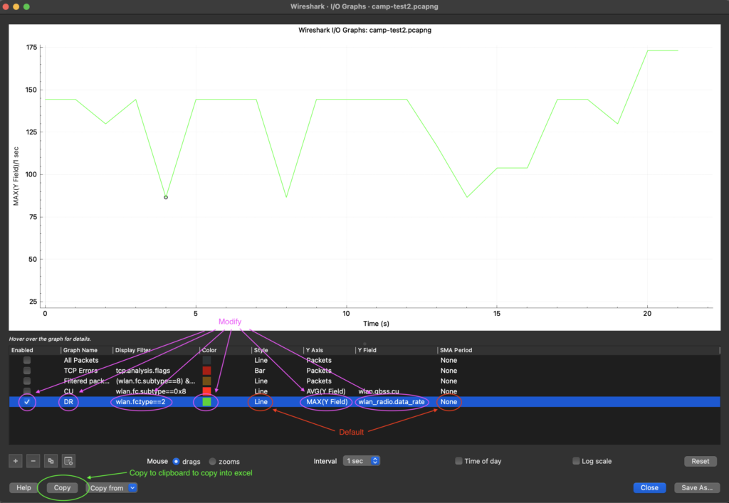
Data Rate
First, let’s look at how we can graph the data rate over time. This is a useful benchmark for evaluating the health of a WLAN. Consistent and high data rates/MCS suggest a poor RF environment with slow talking clients that require deeper investigation as to the root cause. Inconsistent or fluctuating data rates/MCS suggest a poor RF environment with intermittent noise or interference.
You can graph the data rate used to transmit frames using the following filter:
The filter for the data rate field is: wlan_radio.data_rate
You can graph this field over time by using the Wireshark IO Graphs tool.
After opening the IO Graphs tool, double click on the fields to make changes:
- Graph Name: DR (or whatever descriptive name you would like to use)
- Display Filter: wlan.fc.type==2 – Filter to focus on frames containing the field you are interested in examining. For example, filtering on “type==2” will limit the graph to include only data frames, ignoring management (beacon) and ACK frames.
- Color: helpful if each rule has a different colour
- Style: Line (default)
- Y Axis: MAC(Y Field) – defines the scale for the Y-axis
- Y Field: wlan_radio.data_rate – filter for the field you want to plot
- SMA Period: None(default)
- Enabled: Check the box to graph this plot
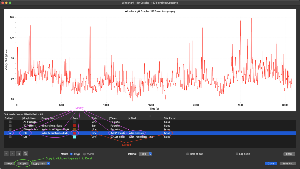
Channel Utilization
There is an optional information QBSS load element inside some management frames that reports channel utilization (CU) from the perspective of the access points radio. The QBSS value is reported on a scale of 255. To determine the percentage, divide the value by 255 – more on this later when we copy data to excel.
The filter for the channel utilization (CU) field is: wlan.qbss.cu
You can graph this field over time by using the Wireshark IO Graphs tool.
After opening the IO Graphs tool, double click on the fields to make changes:
- Graph Name: CU (or whatever descriptive name you would like to use)
- Display Filter:
fc.subtype==0x8– Filter to focus on frames containing the field you are interested in examining. It’s useful to limit the graph to include a subset of the frames you want to focus on. For example, a display filter of “subtype 0x8” will limit the capture to only include beacon frames which contain the QBSS CU field. - Color: helpful if each rule has a different colour
- Style: Line (default)
- Y Axis: AVG(Y Field) – defines the scale for the Y-axis
- Y Field:
wlan.qbss.cu– filter for the field you want to plot - SMA Period: None(default)
- Enabled: Check the box to graph this plot
Exporting to Excel
You can export selected data to excel by clicking on the copy button to copy data onto the clipboard then paste the data into excel.
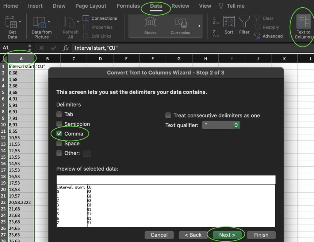
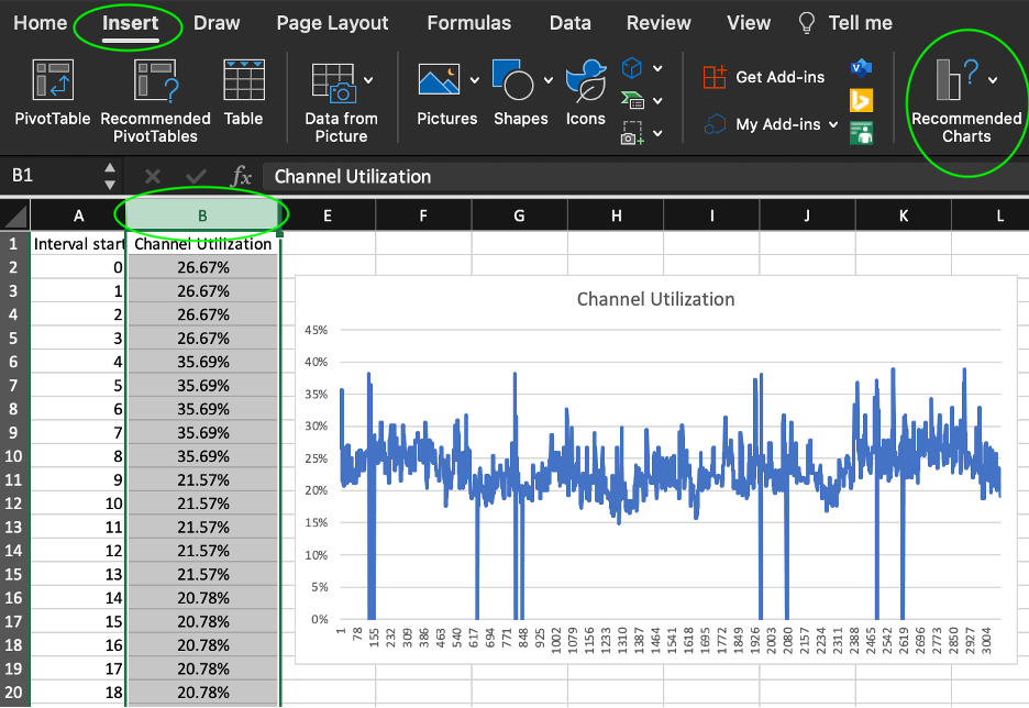
In the case of channel utilization, divide the field by 255 and plot the percentage into a line graph by highlighting the Channel Utilization column, selecting Insert from the menu, then clicking on Recommended Charts > Line Graph.
Slàinte!